
Responsive Design
# Index
# Description
# What Is Responsive Design?
# Why Is Responsive Design Important?
# How Responsive Design Works
# Core Principles of Responsive Design
# Common Device Categories
# Mobile-First Design
# Layout Systems Used in Responsive Design
# Others Responsive
# Common Breakpoints
# Common Mistakes
# Responsive Design Beyond Phones and Desktops
# Responsive Design vs Adaptive Design
# Description:
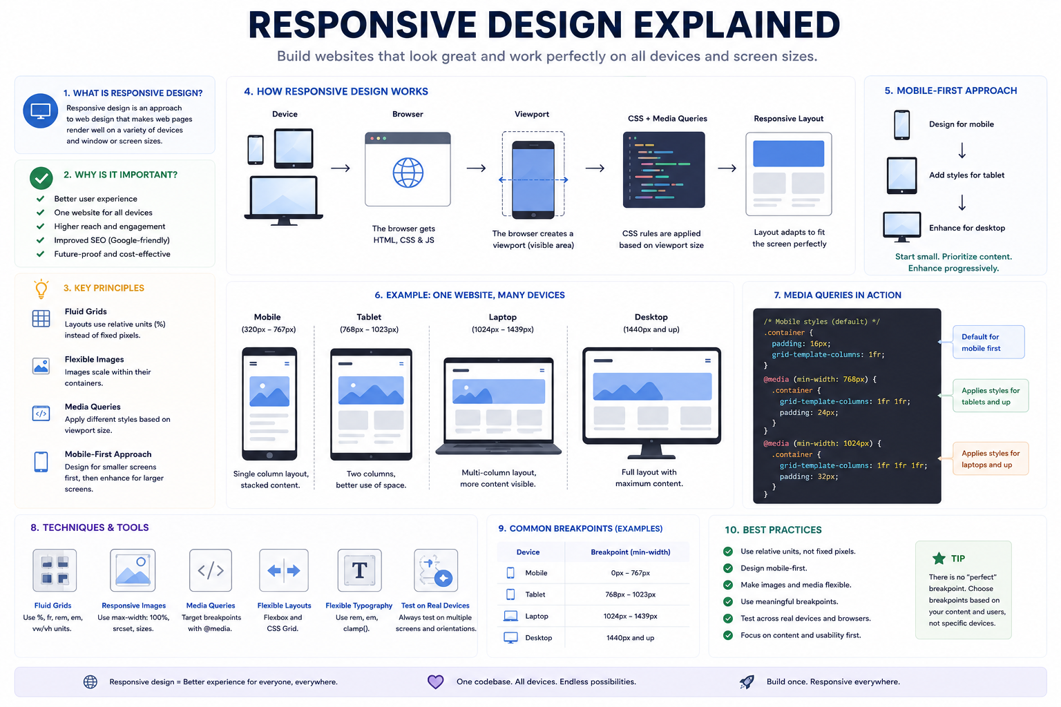
Responsive design is an approach to web development that enables websites and applications to adapt automatically to different screen sizes, devices, and orientations. Instead of creating separate websites for smartphones, tablets, and desktops, responsive design allows a single codebase to provide an optimal experience across all devices. Modern responsive design relies on flexible layouts, media queries, relative units, and viewport-based techniques to ensure content remains usable and visually appealing regardless of screen size.
# What Is Responsive Design?
Responsive design is the practice of creating layouts that adjust automatically based on the available screen space.
For example
Phone: Single Column
Tablet: Two Columns
Desktop: Multiple Columns
Rather than designing separate websites for each device, responsive design enables one website to adapt to different viewports.
# Why Is Responsive Design Important?
Users access websites from:
- Smartphones
- Tablets
- Laptops
- Desktop computers
- TVs
- Foldable devices
Responsive design helps:
- Improve user experience
- Increase accessibility
- Support various screen sizes
- Reduce maintenance costs
- Improve SEO
- Simplify development
Without responsive design, websites may become difficult to use on smaller screens.
# How Responsive Design Works
Responsive layouts adapt based on the viewport size.
Browser Width > Responsive Layout > Content Adjusts Automatically
Elements may:
- Resize
- Reposition
- Wrap onto new rows
- Hide unnecessary content
# Core Principles of Responsive Design
# Flexible Layouts
Example, instead of:
- width: 1200px;
Use:
- width: 100%;
- max-width: 1200px;
Flexible layouts prevent content from overflowing smaller screens.
# Relative Units
Responsive designs favor relative units over fixed values.
Examples:
- %
- em
- rem
- vw
- vh
Instead of:
- font-size: 16px;
Developers may use:
- font-size: 1rem;
Relative units improve scalability.
# Flexible Images
Images should scale with their containers.
img {
- max-width: 100%;
- height: auto;
This prevents images from exceeding screen boundaries.
# Media Queries
Media queries allow styles to change based on viewport size.
Examples: @media (max-width: 768px) { .container { flex-direction: column; } }
Media queries are one of the foundations of responsive design.
# Common Device Categories
# Mobile
Typical width: 320px – 767px
Characteristics:
- Small screens
- Touch interactions
# Tablet
Typical width: 768px – 1023px
Characteristics:
- Larger displays
- Portrait and landscape modes
# Laptop
Typical width: 1024px – 1439px
Characteristics:
- Keyboard and mouse
- Multiple windows
# Desktop
Typical width: 1440px+
Characteristics:
- Large displays
- Rich layouts
# Mobile-First Design
Modern responsive development often follows a mobile-first approach.
Start with: Mobile, then Tablet, then Desktop
Benefits include:
- Better performance
- Simpler layouts
- Improved scalability
CSS usually begins with smaller screens and adds complexity for larger devices.
# Layout Systems Used in Responsive Design
Flexbox
Best suited for:
- Navigation bars
- Cards
- Forms
- Components
Example:
- display: flex;
- flex-wrap: wrap;
Flexbox makes content adapt naturally.
CSS Grid
Best suited for:
- Page layouts
- Dashboards
- Galleries
Example:
- display: grid;
- grid-template-columns: repeat(auto-fit, minmax(300px, 1fr));
Grid provides powerful two-dimensional layouts.
# Others Responsive
Responsive Typography
Text should remain readable across devices.
Instead of fixed sizes:
- font-size: 18px;
Developers often use:
- font-size: 1rem;
or
- font-size: clamp( 1rem, 2vw, 2rem );
This allows fonts to scale naturally.
Responsive Images
Modern websites optimize images using:
- Multiple resolutions
- Lazy loading
- Responsive image formats
Examples:
- WebP
- AVIF
Responsive images improve performance and reduce bandwidth usage.
Responsive Navigation
Navigation may change depending on screen size.
Desktop: Home About Contact Services
Mobile: ☰ Menu
This improves usability on smaller screens.
Responsive Tables
Large tables may become difficult to read on phones.
Solutions include:
- Horizontal scrolling
- Collapsible rows
- Card layouts
# Common Breakpoints
Developers often use ranges instead of targeting specific devices.
| Device | Width |
|---|---|
| Mobile | <768px |
| Tablet | 768px–1023px |
| Laptop | 1024px–1439px |
| Desktop | 1440px+ |
These values vary depending on the application.
# Common Mistakes
Designing for Specific Devices
New devices constantly appear
Responsive design should target screen ranges instead of device models.
Using Fixed Widths
Example: width: 1200px;
Fixed layouts often break on smaller screens.
Ignoring Landscape Orientation
Phones and tablets may rotate.
Layouts should adapt accordingly.
Overusing Media Queries
Modern CSS features such as Flexbox and Grid reduce the need for numerous breakpoints.
Making Buttons Too Small
Touch interfaces require larger interactive elements.
# Responsive Design Beyond Phones and Desktops
Modern applications may run on:
- Smartwatches
- Foldable devices
- TVs
- Automotive displays
- AR and VR systems
Responsive principles help support these emerging form factors.
# Responsive Design vs Adaptive Design
Responsive Design
One flexible layout that adjusts continuously.
Adaptive Design
Multiple fixed layouts for specific screen sizes.
Responsive design is generally preferred because it scales more naturally.
Article Metadata:
Published Date: 2026-07-10
Updated Date: 2026-07-10
About the Author: Team absequ is a group of engineers and researchers working on real-world systems, software development, and technology solutions.