
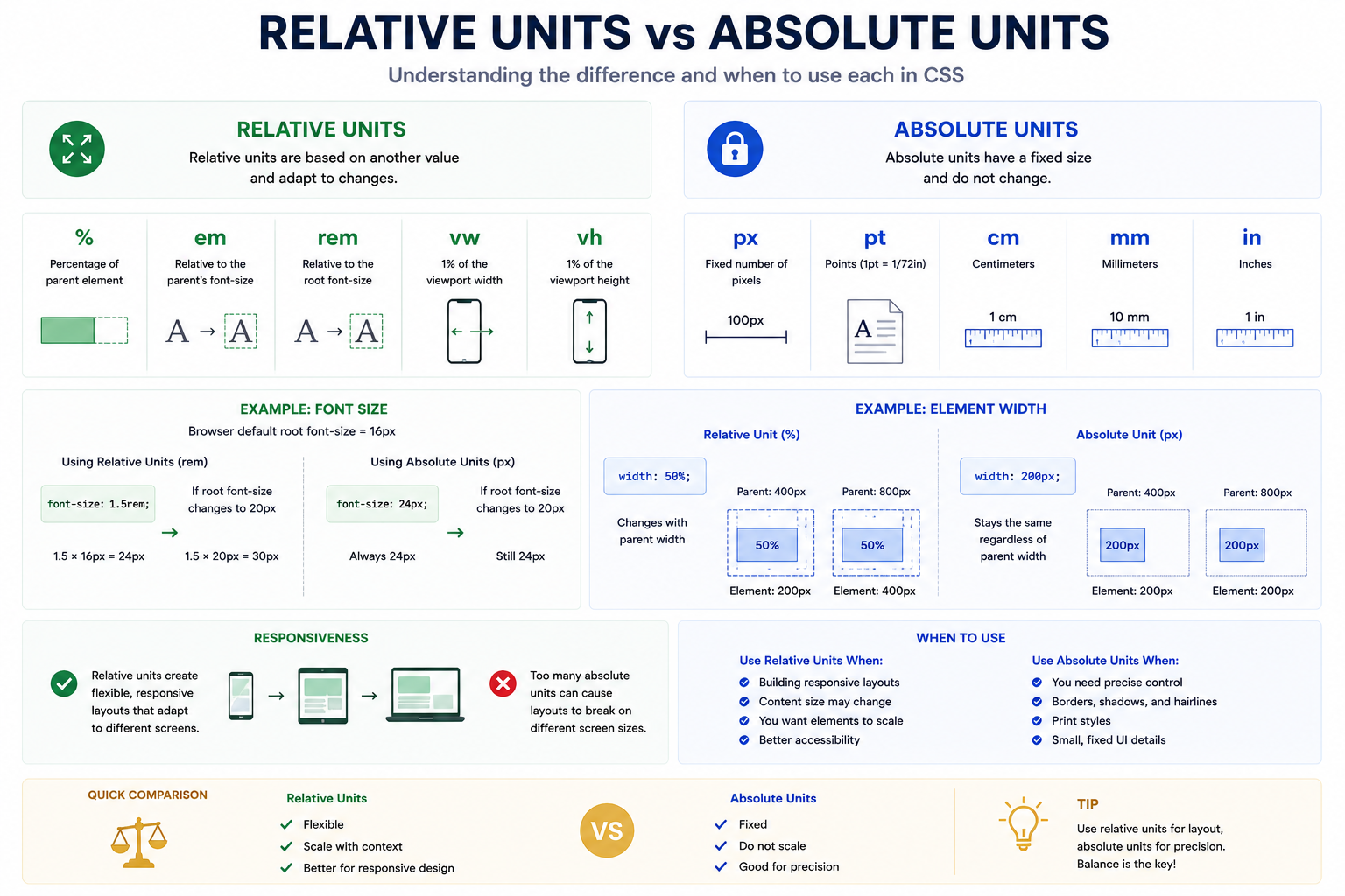
Relative Units vs Absolute Units
# Index
# Description
# What Are CSS Units?
# Absolute Units
# Relative Units
# Viewport Units
# Typography: px vs rem
# Layouts: px vs %
# Responsive Font Sizes with clamp()
# Absolute Units vs Relative Units
# When to Use Absolute Units
# When to Use Relative Units
# Common Mistakes
# Best Practices
# Description:
CSS provides various units for defining sizes, spacing, typography, and layouts. These units are broadly categorized into absolute units and relative units. Absolute units represent fixed sizes that do not change based on their surroundings, while relative units adapt to parent elements, font sizes, or viewport dimensions. Understanding the differences between these units is essential for creating responsive and scalable user interfaces.
# What Are CSS Units?
CSS units specify measurements for properties such as:
- Width
- Height
- Margin
- Padding
- Font size
- Gap
- Border radius
Example: button { width: 200px; padding: 10px; }
The values 200px and 10px are CSS units.
# Absolute Units
Absolute units represent fixed measurements.
Common absolute units include:
| Unit | Meaning |
|---|---|
| px | Pixels |
| cm | Centimeters |
| mm | Millimeters |
| in | Inches |
| pt | Points |
| pc | Picas |
Example: .card { width: 400px; }
No matter where the card is placed, it remains 400 pixels wide.
Pixels (px)
Pixels are the most commonly used absolute unit.
Example: h1 { font-size: 32px; }
Advantages:
- Easy to understand
- Predictable
- Precise
Disadvantages:
- Less flexible
- Doesn't automatically scale with user preferences
Example: h1 { font-size: 32px; }
# Relative Units
Relative units derive their values from something else.
Examples include:
| Unit | Relative To |
|---|---|
| % | Parent element |
| em | Parent font size |
| rem | Root font size |
| vw | Viewport width |
| vh | Viewport height |
| vmin | Smaller viewport dimension |
| vmax | Larger viewport dimension |
| ch | Width of "0" character |
| ex | Height of lowercase x |
Relative units help create responsive layouts.
Percentage (%)
Percentages depend on the parent element.
Example:
- .container { width: 1000px; }
- .card { width: 50%; }
The card becomes: 500px because it occupies 50% of its parent.
em
em is relative to the font size of its parent.
Example, Parent: font-size: 20px;
Child: font-size: 2em;
Result: 40px
Nested elements can compound, sometimes producing unexpected results.
rem
rem means "root em".
It is based on the font size of the root (html) element.
Example:
- html { font-size: 16px; }
- h1 { font-size: 2rem; }
Result: 32px
Advantages:
- Consistent
- Easier to maintain
- Respects browser accessibility settings
Modern applications often prefer rem for typography.
# Viewport Units
Viewport units depend on the browser window size.
# vw
Viewport width
width: 50vw;
Means: 50% of viewport width.
# vh
Viewport height
height: 100vh;
Means: 100% of viewport height.
# dvh
Dynamic viewport height
height: 100dvh;
Accounts for mobile browser address bars and changing screen heights.
Modern browsers increasingly recommend dvh.
# Example Comparison
Fixed Width: .card { width: 400px; }
Responsive Width: .card { width: 80%; } OR .card { width: min(500px, 90%); }
The second approach adapts better to different screen sizes.
# Typography: px vs rem
Using pixels:
- body { font-size: 16px; }
- h1 { font-size: 48px; }
Using rem:
- html { font-size: 16px; }
- body { font-size: 1rem; }
- h1 { font-size: 3rem; }
rem scales better and improves accessibility.
# Layouts: px vs %
Bad:
- .container { width: 1200px; }
Better:
- .container { width: 100%; max-width: 1200px; }
This allows the layout to adapt to smaller screens.
# Responsive Font Sizes with clamp()
Example:
- font-size: clamp( 1rem, 2vw, 2rem );
This means:
- Minimum size = 1rem
- Preferred size = 2vw
- Maximum size = 2rem
Fonts automatically scale with screen size.
# Absolute Units vs Relative Units
| Feature | Absolute Units | Relative Units |
|---|---|---|
| Flexible | No | Yes |
| Responsive | Limited | Yes |
| Accessibility | Limited | Better |
| Based On Parent | No | Sometimes |
| Based On Viewport | No | Yes |
| Predictable | Yes | Depends |
# When to Use Absolute Units
Suitable for:
- Borders
- Icons
- Small shadows
- Precise measurements
# When to Use Relative Units
Suitable for:
- Typography
- Widths
- Heights
- Padding
- Margins
- Responsive layouts
- font-size: 1rem;
- width: 100%;
- padding: 1.5rem;
# Common Mistakes
# Using Fixed Widths Everywhere
Bad, width: 1200px;
This breaks on small screens.
# Overusing em
Nested em values can compound and become difficult to manage.
Modern projects often prefer rem.
# Ignoring Accessibility
Fixed font sizes may not scale properly for users who change browser settings.
# Using vh on Mobile
100vh can behave unexpectedly due to address bars.
Modern CSS prefers: height: 100dvh;
# Best Practices
- Use rem for typography.
- Use %, Flexbox, and Grid for layouts.
- Use vw and vh sparingly.
- Use px for borders and fine details.
- Use clamp() for responsive typography.
- Combine relative units with media queries when needed.
Article Metadata:
Published Date: 2026-07-14
Updated Date: 2026-07-14
About the Author: Team absequ is a group of engineers and researchers working on real-world systems, software development, and technology solutions.