
Tech for Devices
# Index
# Description
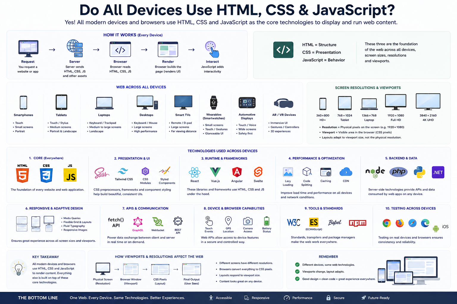
# Do All Devices Use HTML, CSS, and JavaScript?
# HTML: The Structure
# CSS: The Presentation
# JavaScript: The Behavior
# How Browsers Work
# Screen Resolution vs Viewport
# Responsive Design Makes This Possible
# What Technologies Run on Different Devices?
# Beyond HTML, CSS, and JavaScript
# What About Native Mobile Apps?
# Cross-Platform Frameworks
# One Web, Many Devices
# Description:
Modern applications run on a wide variety of devices, including smartphones, tablets, laptops, desktops, smart TVs, smartwatches, and even automotive displays. Despite differences in screen sizes, resolutions, and interaction methods, most web experiences are built upon the same core technologies: HTML, CSS, and JavaScript. These technologies, combined with browsers, frameworks, APIs, and responsive design principles, allow developers to create applications that work consistently across different devices and form factors.
# Do All Devices Use HTML, CSS, and JavaScript?
For web applications, the answer is largely yes.
Whether users access a website from:
- Smartphones
- Tablets
- Laptops
- Desktops
- Smart TVs
the browser ultimately renders:
- HTML for structure
- CSS for presentation
- JavaScript for behavior
For example, opening a website on:
- Phone
- Tablet
- Laptop
- Desktop
still involves the browser interpreting the same HTML, CSS, and JavaScript files.
# HTML: The Structure
HTML defines the content and structure of a webpage.
Example:
- <h1>Welcome</h1>
- <p>This is a paragraph.</p>
- <button>Login</button>
HTML provides:
- Headings
- Paragraphs
- Images
- Forms
- Tables
- Navigation
Without HTML, websites would have no structure.
# CSS: The Presentation
CSS controls how content appears.
Example:
- .button { background: blue; color: white; }
CSS handles:
- Colors
- Layouts
- Fonts
- Animations
- Responsive design
The same HTML can appear differently on phones and desktops because CSS adapts to the viewport.
# JavaScript: The Behavior
JavaScript adds interactivity.
Example:
- button.addEventListener("click", login);
JavaScript powers:
- Dynamic interfaces
- API calls
- Form validation
- Animations
- Real-time updates
Modern frameworks such as React, Angular, Vue, and Svelte are built on top of JavaScript.
# How Browsers Work
When users visit a website:
Server > HTML + CSS + JS > Browser > DOM + CSSOM > Render Tree > Visible Page
Browsers such as Chrome, Firefox, Safari, and Edge handle rendering regardless of the device.
# Screen Resolution vs Viewport
Different devices have different physical resolutions.
| Device | Physical Resolution |
|---|---|
| Smartphone | 1170 × 2532 |
| Tablet | 2048 × 2732 |
| Laptop | 1920 × 1080 |
| Monitor | 3840 × 2160 |
However, layouts respond to viewport size rather than physical pixels.
Example:
- Phone Physical Resolution: 1170 × 2532
- Viewport: 390 × 844
This allows one website to adapt across devices.
# Responsive Design Makes This Possible
Responsive design allows applications to adjust automatically.
Phone: Single Column
Tablet: Two Columns
Desktop: Multiple Columns
Technologies used include:
- Media queries
- Flexbox
- CSS Grid
- Relative units
- Responsive images
# What Technologies Run on Different Devices?
Smartphones Typical technologies:
- HTML
- CSS
- JavaScript
- React
- Vue
- Angular
- Touch
- Gestures
Tablets
- Same technologies as smartphones, with layouts optimized for larger screens.
Laptops and Desktops Browsers support:
- HTML
- CSS
- JavaScript
- Web APIs
- WebAssembly
- Keyboard
- Mouse
Smart TVs browsers also render HTML, CSS, and JavaScript.
- YouTube TV
- Netflix
- Streaming platforms
- Remote controls
- Focus states
- Large typography
Smartwatches Some smartwatch applications use:
- Native technologies
- Web technologies
- Companion applications
- Minimal information
- Quick interactions
Automotive Displays Modern infotainment systems often use:
- HTML
- CSS
- JavaScript
- Native frameworks
- Touch
- Voice commands
# Beyond HTML, CSS, and JavaScript
Modern web development includes additional technologies.
TypeScript Adds static typing to JavaScript.
Sass Enhances CSS with variables and nesting.
Frameworks Examples:
- React
- Angular
- Vue
- Svelte
APIs Applications communicate using:
- REST
- GraphQL
- WebSockets
Build Tools Examples:
- Vite
- Webpack
- Turbopack
Backend Technologies Servers may use:
- Node.js
- Python
- Java
- PHP
- Go
- .NET
# What About Native Mobile Apps?
Not all applications use web technologies.
Native apps use platform-specific languages.
Android
- Kotlin
- Java
iOS
- Swift
- Objective-C
These apps interact directly with the operating system.
However, many applications use cross-platform technologies.
# Cross-Platform Frameworks
Examples include:
React Native Uses JavaScript to build mobile apps.
Flutter Uses Dart.
Electron Uses HTML, CSS, and JavaScript for desktop applications.
Tauri Builds lightweight desktop apps using web technologies.
# One Web, Many Devices
Modern web applications are built once and adapt to:
Smartphone > Tablet > Laptop > Desktop > Smart TV
The underlying technologies remain largely the same.
Responsive design and browsers handle differences in:
- Screen sizes
- Viewports
- Pixel densities
- Input methods
Article Metadata:
Published Date: 2026-07-10
Updated Date: 2026-07-10
About the Author: Team absequ is a group of engineers and researchers working on real-world systems, software development, and technology solutions.