
Breakpoints
# Index
# Description
# What Are Breakpoints?
# Why Are Breakpoints Important?
# Breakpoints Use Viewport Widths
# How Breakpoints Work
# Media Queries
# Common Breakpoint Ranges
# Mobile-First Breakpoints
# Common Breakpoints in Popular Frameworks
# Content-Based Breakpoints
# Too Many Breakpoints Can Be a Problem
# Breakpoints and Flexbox
# Breakpoints and CSS Grid
# Breakpoints Beyond Width
# Common Mistakes
# Responsive Design Without Breakpoints
# Description:
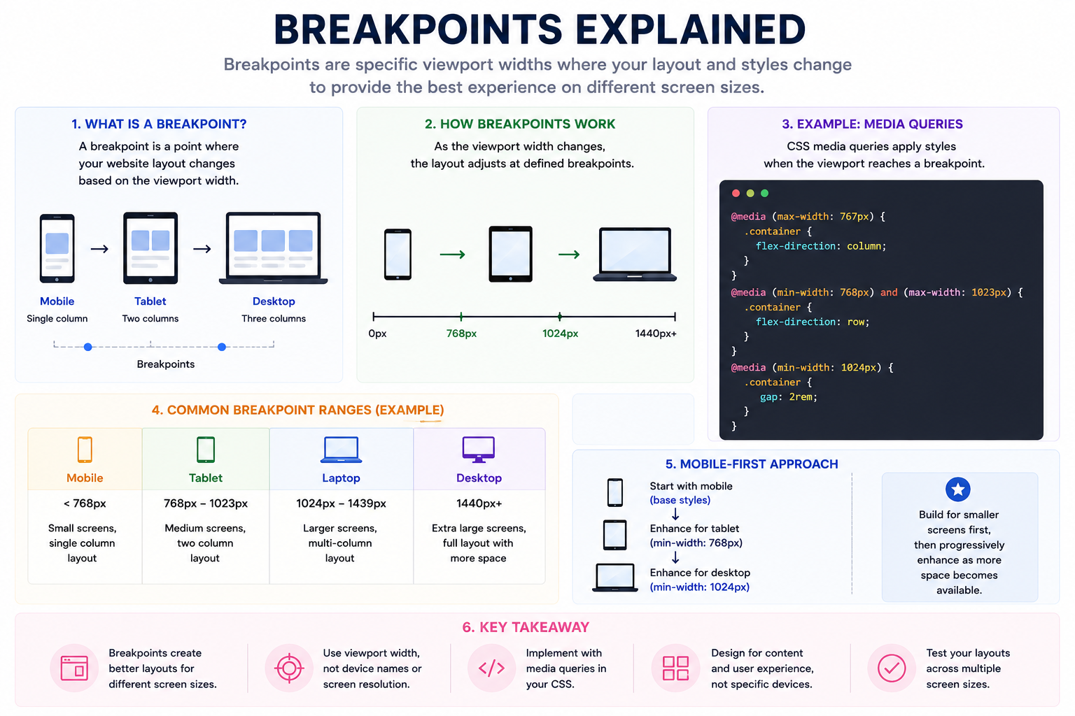
Breakpoints are specific viewport widths at which a website or application changes its layout or styling to provide a better user experience. They are one of the key concepts behind responsive design, allowing content to adapt gracefully across smartphones, tablets, laptops, desktops, and other devices. Modern web development focuses on creating flexible layouts rather than designing for specific devices. Breakpoints help determine when those layouts should adjust.
# What Are Breakpoints?
A breakpoint is a point where the layout changes based on the available screen space.
For example, Mobile: Single Column > Tablet: Two Columns > Desktop: Three Columns
The width at which these changes occur is called a breakpoint.
# Why Are Breakpoints Important?
A breakpoint is a point where the layout changes based on the available screen space.
Without breakpoints, websites may:
- Appear cramped on small screens.
- Waste space on large displays.
- Become difficult to navigate.
- Provide poor readability.
Breakpoints help:
- Improve user experience.
- Optimize layouts.
- Enhance accessibility.
- Support various screen sizes.
- Create responsive applications.
# Breakpoints Use Viewport Widths
Breakpoints are based on viewport dimensions, not physical screen resolutions.
For example:
- Phone Physical Resolution: 1170 × 2532
- Viewport: 390 × 844
- Media queries respond to: 390px not 1170px
# How Breakpoints Work
Suppose a layout contains three cards.
Desktop:
Tablet:
Mobile:
Breakpoints control when these transitions happen.
# Media Queries
Breakpoints are usually implemented using media queries.
Example:
@media (max-width: 768px) { .container { flex-direction: column; } }
This means:
Apply these styles when the viewport width is 768px or smaller.
# Common Breakpoint Ranges
Although there is no universal standard, many projects use:
| Device Category | Width |
|---|---|
| Mobile | < 768px |
| Tablet | 768px – 1023px |
| Laptop | 1024px – 1439px |
| Desktop | 1440px+ |
These are guidelines, not strict rules.
# Mobile-First Breakpoints
Modern development often uses a mobile-first approach.
Base styles:
.container { display: flex; flex-direction: column; }
Tablet and larger:
@media (min-width: 768px) { .container { flex-direction: row; } }
Desktop:
@media (min-width: 1024px) { .container { gap: 2rem; } }
This approach progressively enhances layouts as more space becomes available.
# Common Breakpoints in Popular Frameworks
Tailwind CSS
| Prefix | Width |
|---|---|
| sm | 640px |
| md | 768px |
| lg | 1024px |
| xl | 1280px |
| 2xl | 1536px |
Example: <div class="grid md:grid-cols-2 lg:grid-cols-3">
Bootstrap
| Breakpoint | Width |
|---|---|
| sm | 576px |
| md | 768px |
| lg | 992px |
| xl | 1200px |
| xxl | 1400px |
MUI
| Breakpoint | Width |
|---|---|
| sm | 600px |
| md | 900px |
| lg | 1200px |
| xl | 1536px |
# Content-Based Breakpoints
Modern responsive design recommends creating breakpoints when the layout starts breaking, not when a specific device appears.
Example, Instead of saying: iPad width = 768px
Think: When do these cards become too narrow?
Content should determine breakpoints.
# Too Many Breakpoints Can Be a Problem
Poor approach:
- @media (max-width: 391px)
- @media (max-width: 414px)
- @media (max-width: 430px)
- @media (max-width: 768px)
- @media (max-width: 820px)
This becomes difficult to maintain.
Modern CSS features such as Flexbox and Grid often reduce the need for numerous breakpoints.
# Breakpoints and Flexbox
Flexbox allows layouts to adapt naturally.
Desktop:
Card Card Card
Small screen:
Card
Card
Card
Sometimes Flexbox eliminates the need for explicit breakpoints.
# Breakpoints and CSS Grid
CSS Grid provides powerful responsive layouts.
Example:
grid-template-columns: repeat(auto-fit, minmax(300px, 1fr));
The browser automatically determines how many columns fit.
This reduces dependence on media queries.
# Breakpoints Beyond Width
Media queries can also target:
Height
@media (max-height: 600px)
Orientation
@media (orientation: landscape)
Dark Mode
@media (prefers-color-scheme: dark)
Reduced Motion
@media (prefers-reduced-motion: reduce)
These improve accessibility and user experience.
# Common Mistakes
Designing for Specific Devices
Avoid: iPhone 16 breakpoint, Samsung breakpoint, Pixel breakpoint
New devices constantly appear.
Design for screen ranges instead.
Excessive Media Queries
Too many breakpoints make code harder to maintain.
Ignoring Large Screens
Ultra-wide monitors are increasingly common.
Layouts should scale gracefully.
Forgetting Content
Breakpoints should serve the content, not the device.
# Responsive Design Without Breakpoints
Modern CSS features such as:
- Flexbox
- Grid
- clamp()
- min()
- max()
- auto-fit
- auto-fill
allow layouts to adapt naturally, reducing reliance on explicit breakpoints.
Article Metadata:
Published Date: 2026-07-13
Updated Date: 2026-07-13
About the Author: Team absequ is a group of engineers and researchers working on real-world systems, software development, and technology solutions.
Further Reading: